Upsonic AI agent Framework
The Upsonic Dashboard was redesigned to address critical usability challenges, such as navigation complexity and inconsistent content placement. The new design prioritizes a seamless and intuitive user experience, enabling users to interact with the platform more efficiently and effectively.

Project Overview
Challenge
The initial Upsonic dashboard presented several challenges for users. Key issues included complex navigation, inconsistent content placement, and a lack of cohesive structure, which led to confusion and inefficiency.
Goal
The Upsonic Dashboard underwent a comprehensive redesign to improve usability, navigation, and visual consistency. The primary focus was on enhancing the user experience by addressing key pain points and creating a more seamless and efficient platform.
CATEGORY
Dashboard Redesign for Improved Usability
ROLE
User Experience Designer
TOOLS
Adobe Photoshop,
Figma
TIMELINE
3 months
Table of Contents
1. Research & Analysis
2. Solution Process
3. Feedback Insights & Observations
5. Design System Integration
6. Takeaways
7. Result & Impact
4. Prototype & Design
Research & Analysis
I began by analyzing the existing dashboard layout and identifying specific pain points. This involved evaluating the navigation flow and content organization to determine areas for improvement.

PAIN POINT #1
Confusing Navigation Structure

Users found it challenging to find essential features and navigate sections because of a disorganized menu and varying hierarchy. Related functions were dispersed, which hindered quick access.
PAIN POINT #2
Cluttered and Inconsistent UI

The dashboard's visual elements, including buttons, text, and icons, were styled inconsistently and misaligned. For instance, mismatched font sizes and button placements led to visual clutter.
PAIN POINT #3
Lack of Clear User Feedback

Interactive elements like form submissions or error states did not provide adequate feedback to users. For example, after an action was performed (e.g., adding a library), users were unsure if it was successful or not.
PAIN POINT #4
Inefficient Information Architecture

The dashboard's visual elements, such as buttons, text, and icons, were inconsistently styled and misaligned. For example, differing font sizes and button placements created visual clutter.

Solution Process
Using my insights, I developed a new sitemap for the dashboard that provided a clearer structure. From this sitemap, I created wireframes and later transformed them into low-fidelity and high-fidelity prototypes, incorporating user feedback from client meetings. Although direct user testing was not conducted, I actively participated in meetings to gather feedback, which guided design adjustments.

Feedback Insights &
Observations
Throughout the redesign process, I documented key observations from client meetings and usability feedback. These insights helped refine the dashboard’s structure and improve its overall usability.
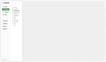
Home and Libraries Similarity
Clients expressed confusion due to the similar structure and content of the Home and Libraries pages. This led to ambiguity in navigation and usage.
%205.png)
HOME

LIBRARIES
Solution: Proposed merging the two pages or creating clearer distinctions to reduce redundancy and improve user flow.
%202.png)
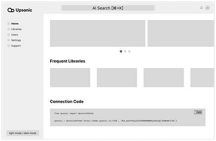
HOME WIREFRAME
%203.png)
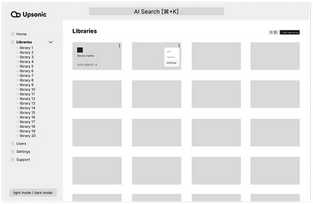
LIBRARIES WIREFRAME
Dropdown Menus for Sidebar
Users found the static sidebar limiting for navigation. Dropdown functionality was suggested to simplify access to nested sections.
%204.png)
SIDEBAR’S OLD STRUCTURE

UPDATED DROPDOWN DESIGN WIREFRAME


.png)
%202.png)
Prototyping & Design
Based on insights gathered during client meetings and the established design direction, I created both lo-fi and hi-fi prototypes. These prototypes were informed by user needs and aimed to address identified pain points, streamline navigation, and improve overall usability.

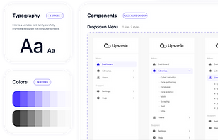
Design Systems Integration
Throughout the design process, I leveraged the existing design system, shadcn, which provided a cohesive foundation for maintaining visual consistency across the dashboard components.

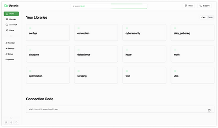
Hi-Fi Prototype
Takeaways
Implemented an organized color palette and consistent typography, enhancing readability and visual appeal.
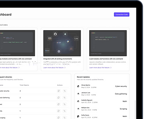
Optimized button placements and improved menu layouts, reducing user effort in navigating the interface.
.png)
Made branding adjustments that aligned the interface more closely with Upsonic’s brand identity, subtly improving user perception and engagement.